CODE
.button {
display: block;
position: relative;
background: #83c11e;
width: 24rem;
padding: 1.5rem;
border-radius: .6rem;
color: #fff;
text-align: center;
text-decoration: none;
font-weight: bold;
letter-spacing: .1rem;
transition: .5s;
}
.button:before {
content: "";
position: absolute;
top: 46%;
right: 12px;
width: 10px;
height: 2px;
background: #fff;
transform: rotate(45deg);
}
.button:after {
content: "";
position: absolute;
top: 54%;
right: 12px;
width: 10px;
height: 2px;
background: #fff;
transform: rotate(-45deg);
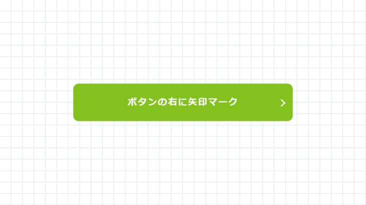
}<a class="button" href="https://code-idea.com/">
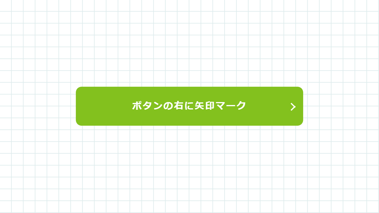
<span>ボタンの右に矢印マーク</span>
</a>DEMO
See the Pen button-sample-013 by CODE IDEA (@codeidea) on CodePen.
※ブラウザにデフォルトで付いているスタイルを消すため、リセットCSS「destyle.css」を使っています。
※CSSの指定方法は一例であり、同じ見た目を違う書き方で表現することもできます。絶対正しいというものではありません。
MEMO
「.button:before」と「.button:after」で細い長方形を作り、それぞれ逆方向に同じだけ傾けて、位置調整をすると矢印マークのように見えます。
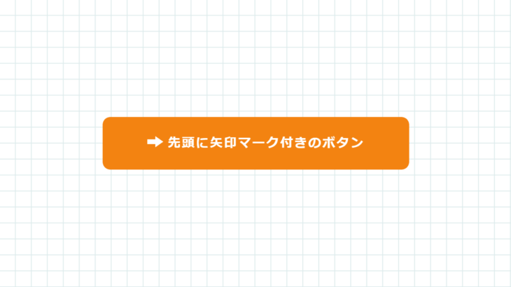
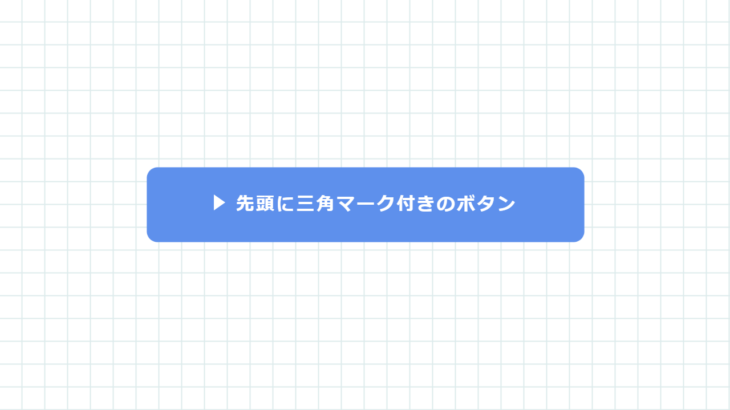
クラス名、各数値、色の指定、リンク先、文言は用途に合わせて変えてください。
MANUAL
| background | 背景色の指定 |
| position | 配置の指定 |
| width | 横幅の指定 |
| height | 縦幅の指定 |
| padding | ボックス内の隙間の指定 |
| border-radius | 境界線角丸の指定 |
| color | 文字色の指定 |
| text-align | 文字位置の指定 |
| text-decoration | 文字装飾の指定 |
| font-weight | 文字ウェイトの指定 |
| letter-spacing | 文字間の指定 |
| transition | 変化の指定 |
| padding-left | 内側の間隔(左方向)の指定 |
| content | :after :before を使う際に必須 |
| top | 上方向 位置の指定 |
| left | 左方向 位置の指定 |
| transform | 変形の指定 |